Compass
A camping platform that empowers people and their friends to plan trips, track items, and discover new places.
Duration: Sep 2019 - Dec 2019 (Revisited 2021)
Team and role: Solo project; UX Design, UX Research
Type: Interaction Design Project
Skills Used: Semi-structured Interviews, Competitive Analysis, Research Synthesis, Personas, User Flows, User Journeys, Critical Design Evaluation, Paper Prototyping, User Testing, Wireframing, High-Fidelity Interactive Prototyping
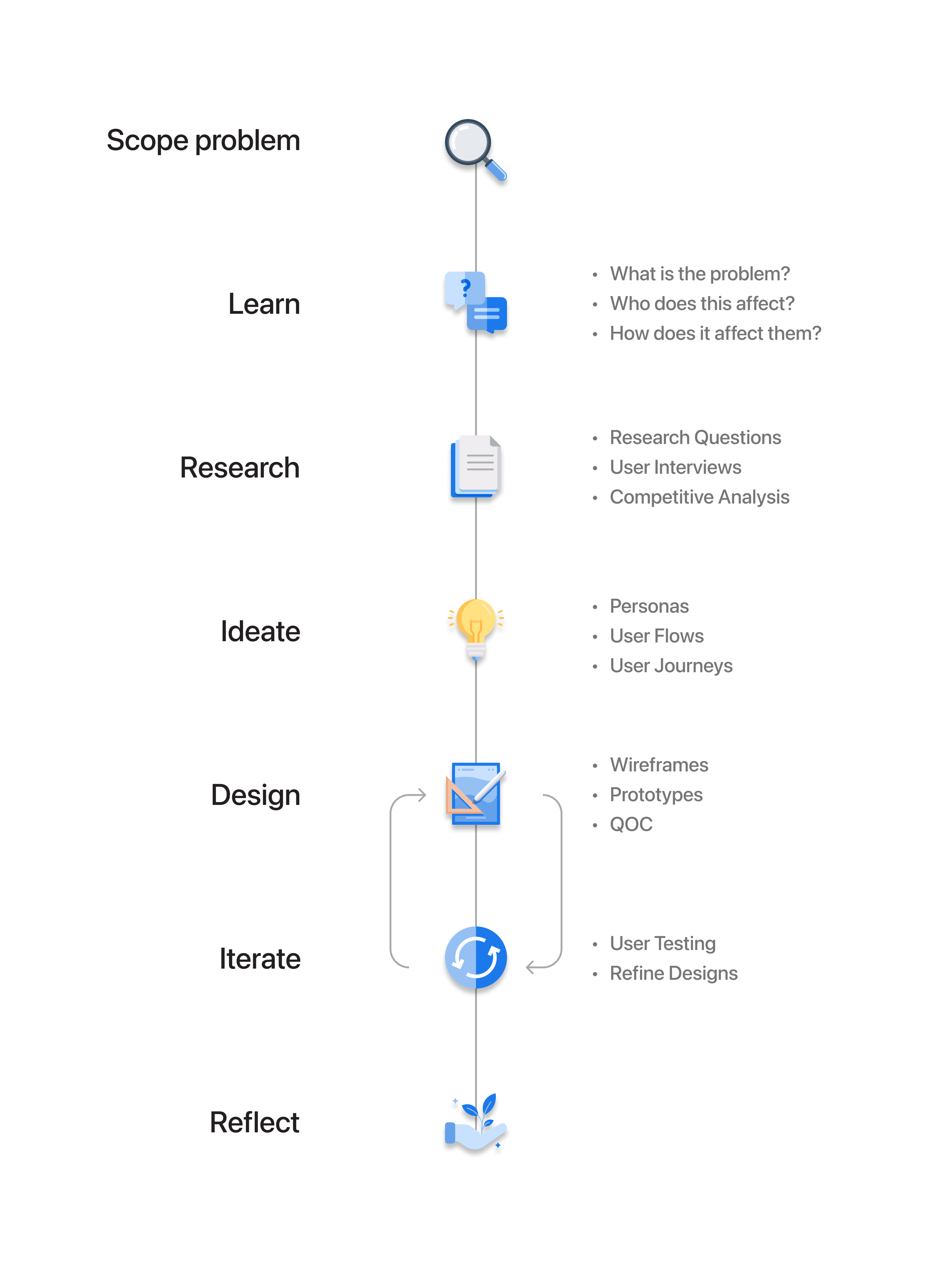
Project process timeline
Problem
What is this campground like? What can I do while I'm there? How do I know what to bring with me?
Compass targets an issue that I'm personally passionate about. Planning a camping trip can be a complicated process. While people may get better at planning these trips the more they take, camping can be intimidating for the beginner. Plus, everyone can benefit from a more organized trip. Compass streamlines the trip planning process by allowing users to plan and coordinate trips with friends.
Research
I had a feeling that I wasn't alone in my trip planning weak spots. I conducted some research to figure out if others were experiencing similar issues; I wanted to know when and why people were facing problems when camping and how well prepared they were before taking a trip.
Research Questions
- When camping, how do people prepare for the outdoors?
- What is the role of a mobile device when camping?
- What are users' levels of preparedness before and during a camping trip?
RESEARCH
Interviews
In order to learn first-hand about major pain points in camping and trip planning, I interviewed people. These semi-structured interviews were great for gathering rich data, allowing me to probe about each person's specific camping needs and decisions. There was a broad spectrum of camping experience among my participants, ranging from almost none to a lifetime of camping.
Key Takeaways
- People want a balance between planning and room for spontaneity.
- People need a way to coordinate bringing things among friends.
- Mobile phones play a significant role throughout campers’ trips.
- Campers have varying levels of what they want out of their trip, especially depending on the nature of the trip.
RESEARCH
Competitive Analysis
I next wanted to find out what other trip planning/camping platforms were out there to see how they compared to my vision of Compass. To get a sense of the variance among each platform, I listed the most important features of Compass and compared each platform based on those features. Unsurprisingly, campers have dozens of resources available to them—however, to get the best of all platforms they'd have to be using several at a time.
Key Takeaways
- Focus on the social aspect of coordinating a camping trip.
- No one has a pack list feature! (While this makes me wonder if there is a true need for a pack list, my need-finding interviews suggest that there is.)
- General complaints about poor information architecture and reliability of campground information.
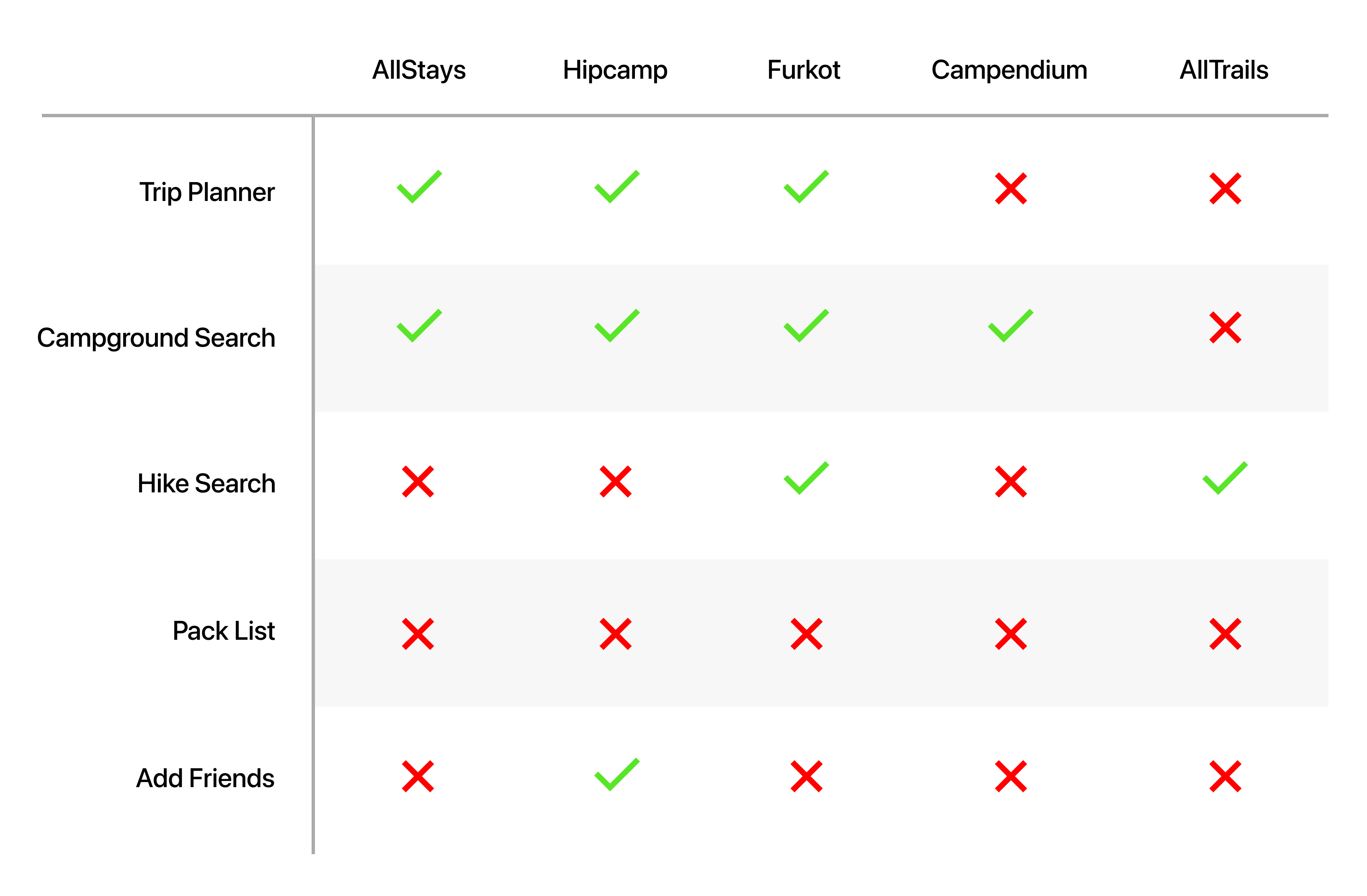
Competitive analysis comparison matrix. Here is a more detailed competitive analysis ↗
RESEARCH
High-level Research Takeaways
My research showed that everyone has their own style and approach to planning a camping trip. My key discoveries were that people desire a mixture of planning and spontaneity, coordinating with friends is important, and knowing what a campground is like before driving to it is necessary.
Target Audience
Campers
- These are people using a tent or a backpack to take a trip of any length, anywhere in the US, who would like to make the process of planning a trip a bit smoother. These people can take as little as one trip per year or as many as over twenty.
Day Hikers
- Day hikers can use Compass to locate and read reviews of trails nearby.
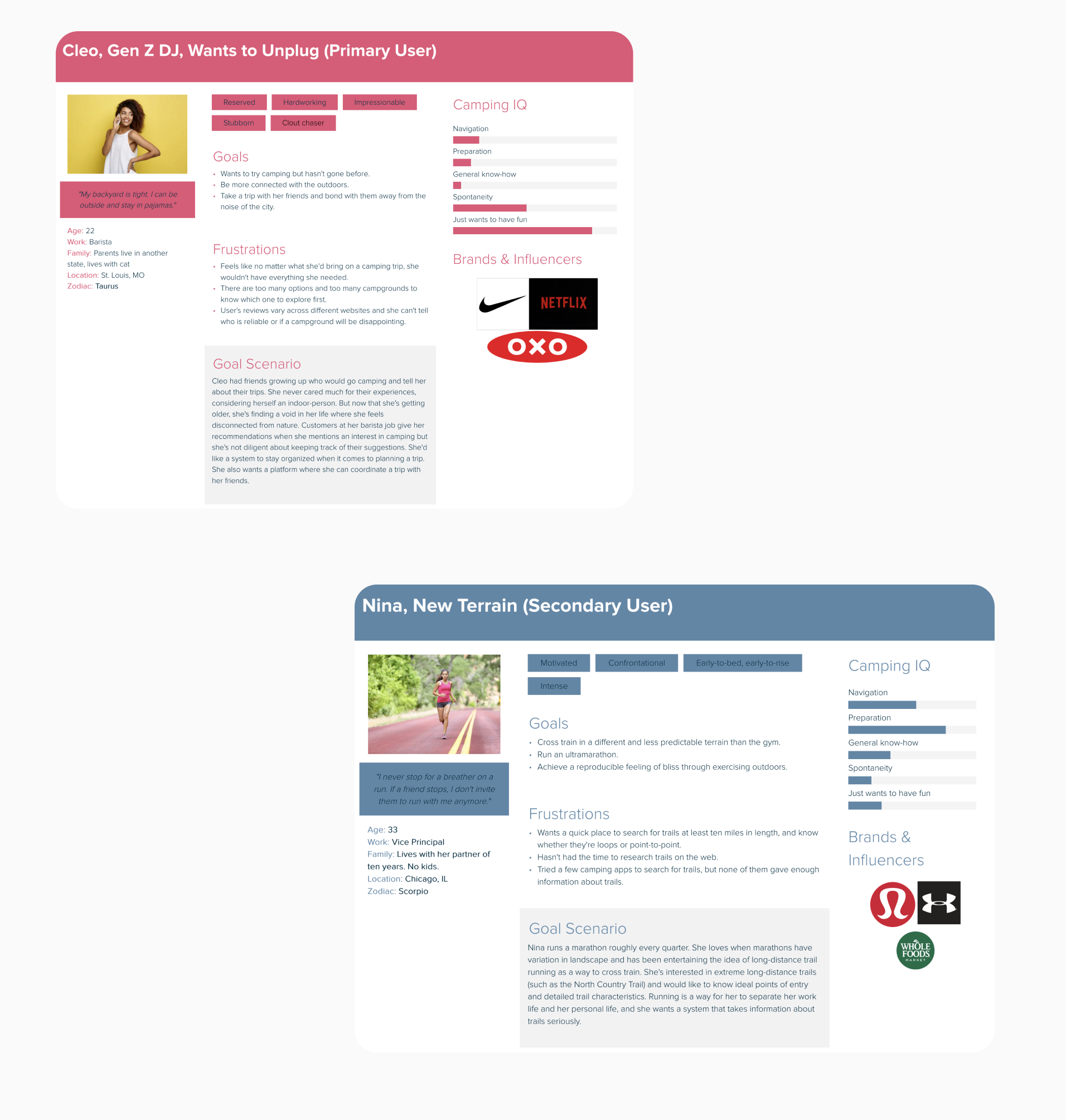
User personas for Compass
IDEATION
Personas
Based on my need-finding interviews and other research, I created evidence-driven personas. The personas included here represent my two target users: campers and day hikers. Through the personas I was able to visualize with more clarity who might be using Compass and what kind of unique needs or struggles they might have, providing me with more insight for feature development.
IDEATION
User Flow and User Journey
Once I felt like I had a good understanding of what users of Compass desired, I mapped out user flows and user journeys. The user flows gave me a high level understanding of where each interaction would happen and what kinds of decisions the users would need to make. The user journeys quickly showed me where interaction breakdowns might happen in a more specific context. This helped me strategize my design decisions before jumping into more detailed designs.

Left and middle: User journeys. Right: User flow.
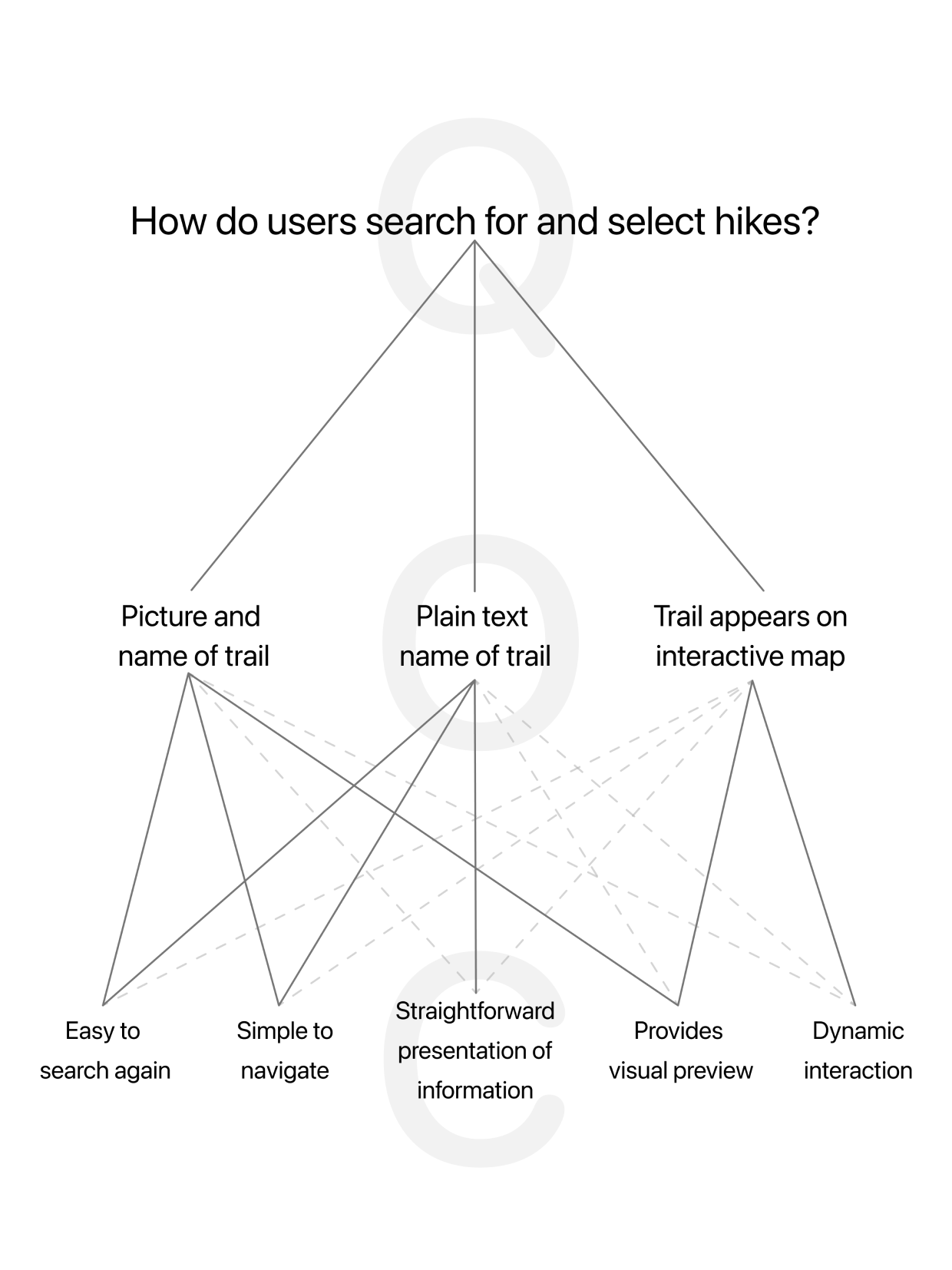
Example visualization of the QOC process
IDEATION
Question, Options, Criteria
After seeing a model of my interactions on my user flow, I wanted to evaluate the most important interactions more closely. I conducted a QOC on the hike search feature because I felt that that was the most universally appealing feature of Compass—both campers and people looking for a quick trip to a trail could benefit from it. The QOC was a helpful because I was thinking critically about very detailed interactions of one feature in addition to defending my design decisions.
DESIGN
Paper Prototype
Before jumping into digital interactions and designs, I wanted to create a flexible system of interactions that I could use for "hallway" tests. I put together a paper prototype of my interactions. The paper prototype was great for getting peoples' quick impressions and making changes on the fly—I quickly learned which interactions were smooth and intuitive and which interactions were clunky and disruptive.
Paper prototype video demo
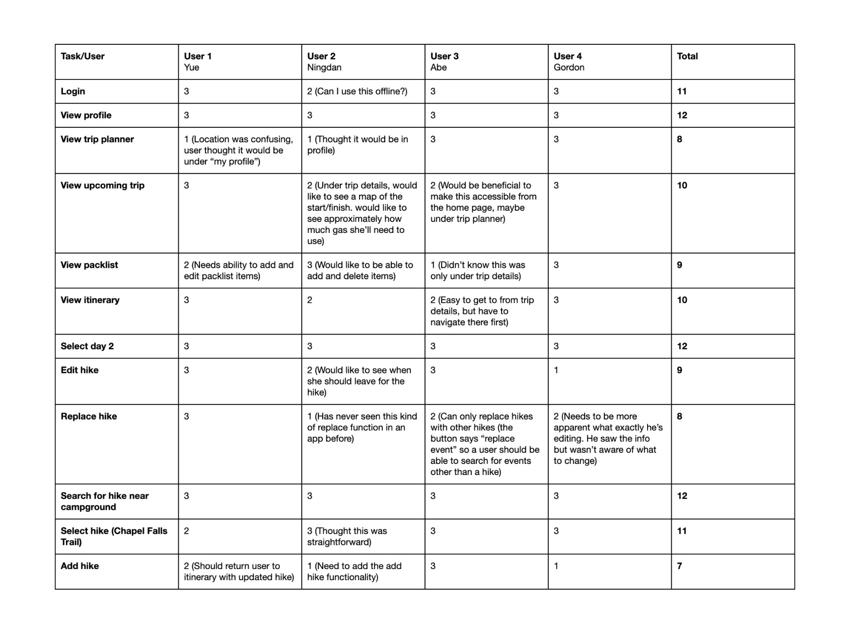
User testing matrix conducted with paper prototype. View a PDF of the user testing matrix ↗
ITERATION
User Testing
In order to systematically score the efficiency of my initial interactions, I conducted user tests. The user tests offered me immediate feedback on my most important interactions which allowed me to prioritize what I needed to improve. This was an effective way to test my assumptions regarding which interactions I thought would be smooth and how I should be organizing my information architecture.
DESIGN
Medium Fidelity Wireframe
At this point I was ready to begin designing interactions as they would appear on the mobile app. I mocked up several screens to map out Compass's main features—interactions that could be tested before investing a lot of time in details, as things were bound to change. This was a good opportunity for me to reevaluate my design decisions after seeing them play out on the screen.

Sample wireframe for one of Compass’s interactions
DESIGN
Features and Final Design
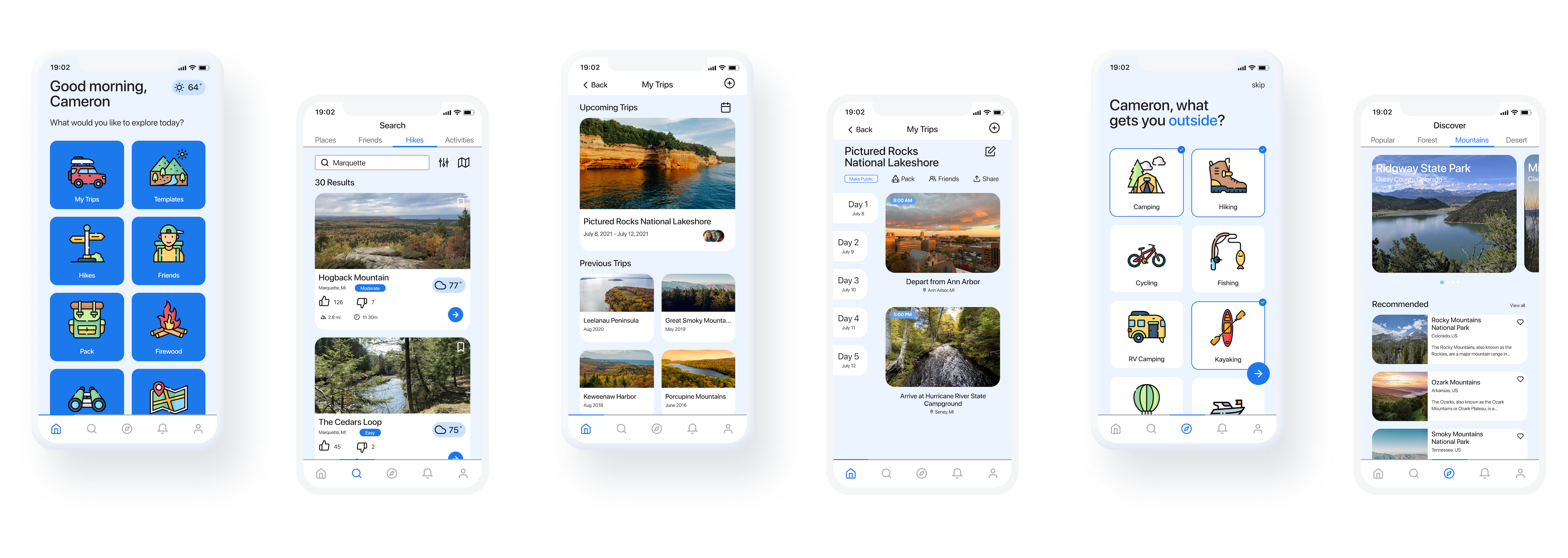
Once my wireframes were in a good place and I had refined some interactions, I was ready to build features. Here are examples some of Compass's core features in its latest iteration.
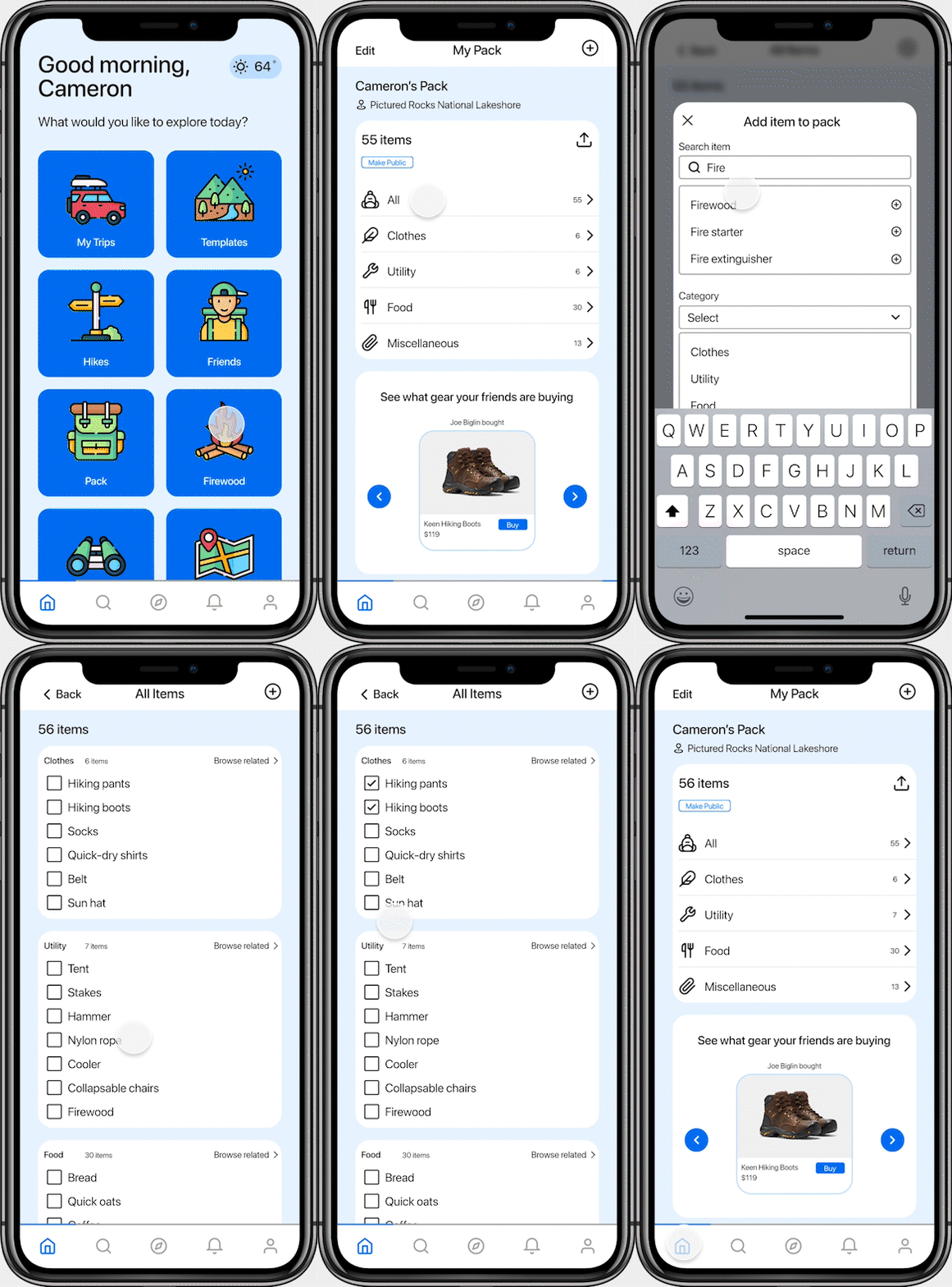
Add Item to Pack
One of the core features of Compass, my design intention was to balance between simplicity and high functionality.
Edit Trip Item Time
There is a lot of granularity involved in planning a trip. I wanted to be sure I was paying close attention to the smaller, more detailed interactions in Compass. This feature allows people to change the time of a trip item. Further iterations of the prototype will allow people to swap trip items for replacements.
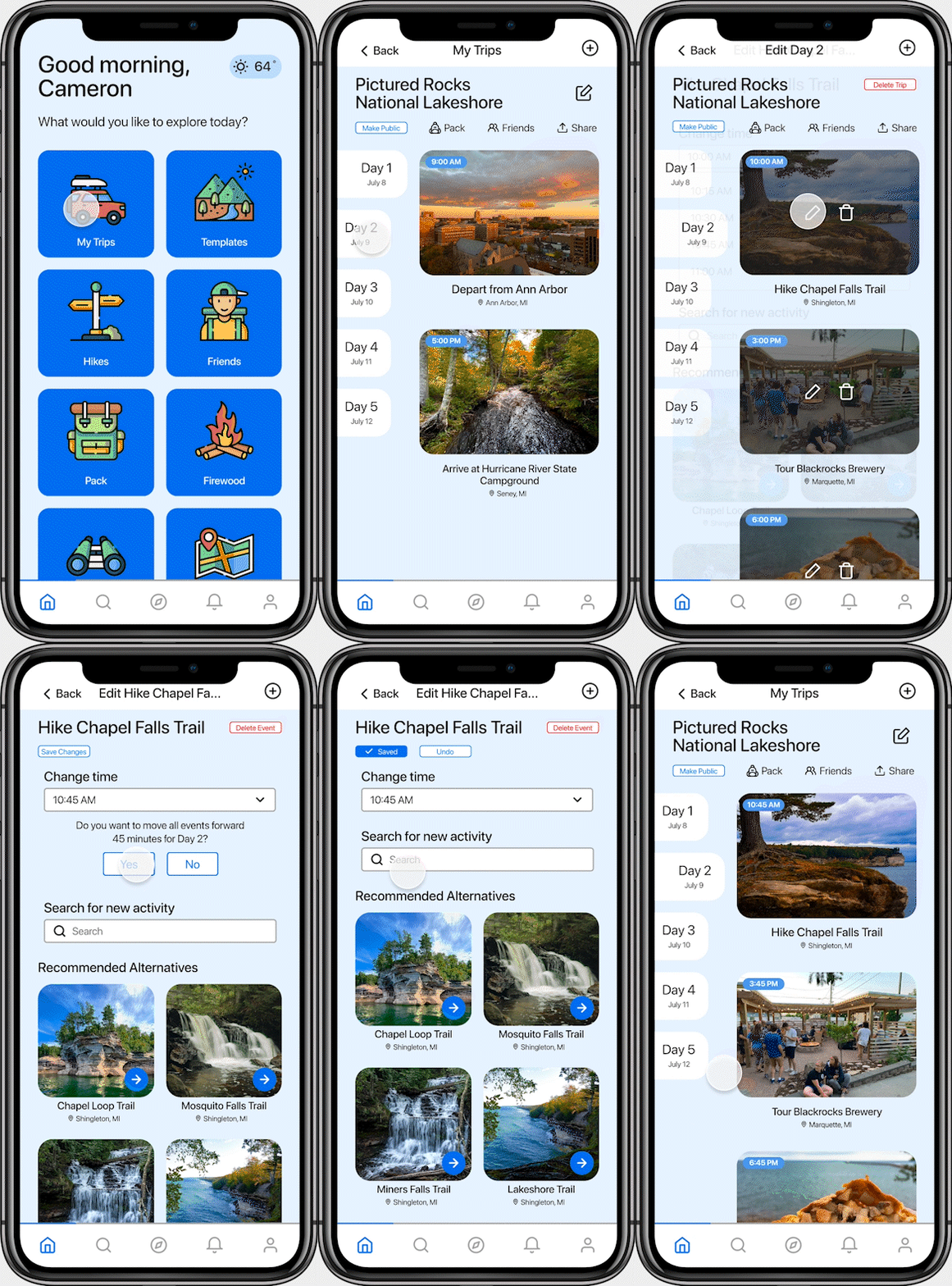
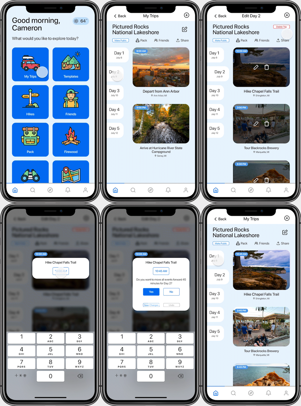
Alternative Edit Trip Item Time
My feeling was that there could be an alternative and more graceful way to edit a trip item's time without the option to replace the trip item with a different one. I designed another interaction for this. In the future, I would love to conduct user tests to compare the two edit trip time features and determine the usefulness of each.
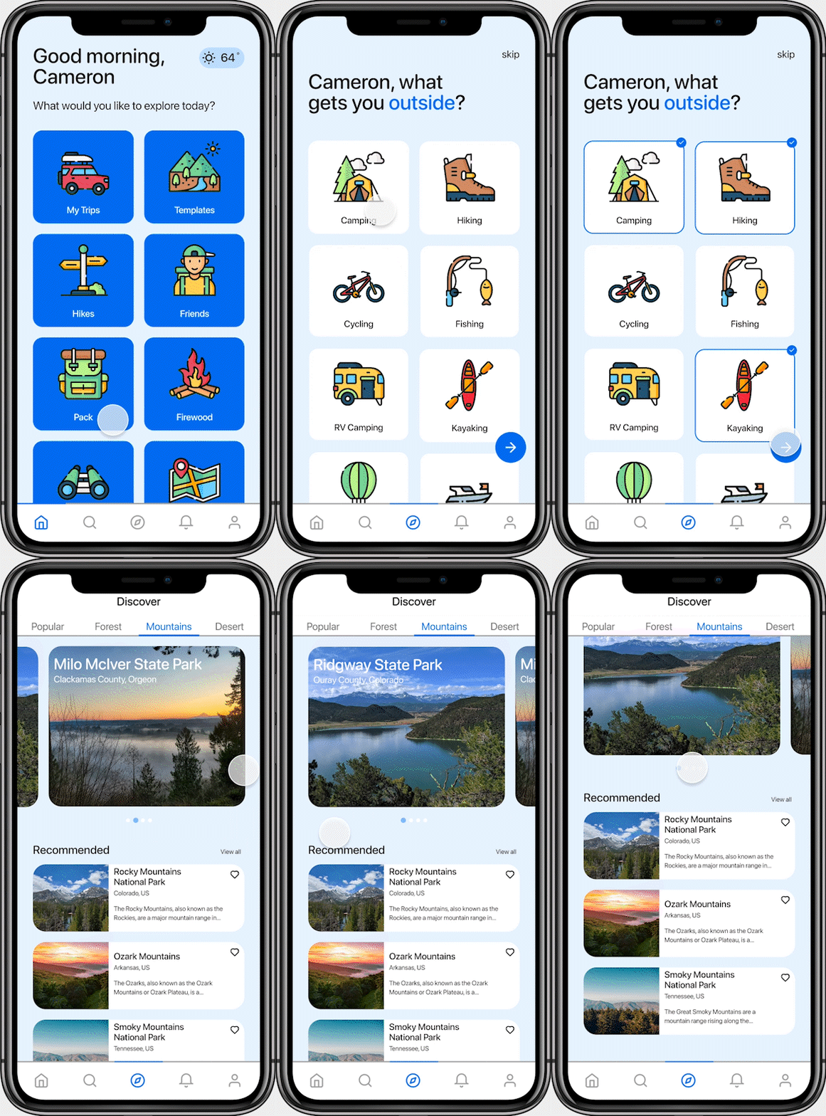
Discover Places
The discover feature takes note of the user's interests in order to personalize recommendations for places to visit and camp. It can also be used to filter between terrain styles such as mountains, forests, and deserts.
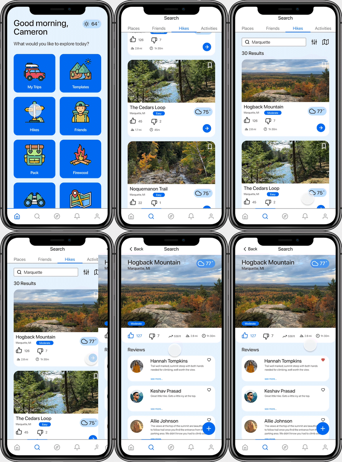
Hike Search
The hike search shows users a preview of as much information about a hike as possible without overwhelming them. Understanding common design conventions and Gestalt principles helped me arrive at a clean, easy-to-scan hike search feature.
For a look at the complete interactive Compass prototype, visit this Figma page ↗
REFLECTION
Key Takeaways
Avoiding my inherent bias
- I created Compass because I noticed a pain point in my own camping planning process that I thought could be smoother. I figured that most people would share the problems I was experiencing. This was not the case. Through my interviews and research I learned that everyone has very different styles, approaches, and needs when camping. Listening to their stories and distilling them into insights made Compass more accessible and more versatile.
Most, if not all, ideas already exist
- My intention with Compass was not to re-invent the wheel but to make a specific tool that would benefit a particular group of people. By thinking of ways to bridge the gaps between, say, a trip planning app and a campground/trail encyclopedia, I was able to create a cohesive solution to a multi-faceted problem.
Thoughtful graphic design is essential for cohesion
- It was not until after I gained a solid understanding of graphic design that I 1) learned the importance of design elements such as color palettes, typography, and gestalt theory for buttressing interactions and 2) was able to revisit Compass to make it altogether cleaner and more whole.
Future Work
There are so many things that I believe users would benefit from that I have not yet been able to research, prototype, and test. A few of these features are:
Booking and Reservations
- An important part of planning a camping trip is ensuring you'll actually have a place to sleep at night. Connecting Compass to official booking services (such as what the DNR of most states offers) could streamline the camping planning experience even more.
Personal Trip Curation
- A popular feature of many tools and mobile apps is an awareness of the user's tendencies and preferences (such as Spotify's Discover Weekly playlist). I believe that Compass would benefit from a user-centered algorithm that generates curated destinations, itineraries, and activity suggestions based on a user's past activity.
User Reviews
- User reviews are extremely helpful for offering guidance to people who want to know more about an area they've never visited before.
Gamification
- Many apps that keep track of users' experiences, in addition to their primary function, offer "awards" or recognition based on a user meeting certain goals. Adding elements of gamification as a way to track experiential milestones can be a fun way to encourage more outdoor activity or adventurism.
Making Interactions Even More Seamless
- Additionally, there are so many interactions that I'd like to offer alternatives for (such as designing an easier way to adjust the time of a trip event). I'm excited to work on refining those interactions in further iterations of Compass.